Tables
Содержание:
- Текст справки
- Текст формы
- Типографика
- Валидация формы
- Пользовательские компоненты
- Toggle buttons
- Form Styles
- Текст формы
- Direction
- Supported Form Controls
- Form Helper Options
- Подключение к функции PHP Mail
- Флажки и переключатели
- Forms
- Required Fields
- Block buttons
- Наводим блеск
- Quick start
- More Bootstrap Form Templates for Free use
- Important globals
Текст справки
Bootstrap 4 предоставляет класс .form-text, который можно использовать для обозначения текста справки. Вы можете комбинировать этот класс со служебными классами, такими как .text-muted.
Вам также следует использовать атрибут aria-descriptionby, чтобы связать текст справки с полем формы. Это гарантирует, что программы чтения с экрана смогут сообщить текст справки, когда пользователь переведёт фокус на поле формы.
<link rel=»stylesheet» href=»https://maxcdn.bootstrapcdn.com/bootstrap/4.0.0/css/bootstrap.min.css»>
<label for=»accountId»>Идентификатор аккаунта</label>
<input type=»text» id=»accountId» class=»form-control» aria-describedby=»helpAccountId»>
<span id=»helpAccountId» class=»form-text text-muted»>Идентификатор аккаунта находится в верхней части счёта.</span>
Bootstrap 4 против Bootstrap 3
Bootstrap 4 использует класс .form-text для отображения текста справки, Bootstrap 3 использует класс .help-block.
Текст формы
Текст формы на уровне блока или на уровне строки может быть создан с помощью .
Связывание текста формы с элементами управления формой
Текст формы должен быть явно связан с элементом управления формы, к которому он относится, с помощью атрибута . Это гарантирует, что вспомогательные технологии, такие как программы чтения с экрана, будут объявлять этот текст формы, когда пользователь фокусируется или входит в элемент управления.
Текст формы под полями может быть оформлен с помощью . Если будет использоваться элемент уровня блока, добавляется верхнее поле для удобного разнесения между входными данными выше.
Встроенный текст может использовать любой типичный строчный HTML-элемент (будь то , или что-то еще) с не более чем классом .
Типографика
Bootstrap позволяет использовать классы для H1-H6. Они помогают задать стили встроенных элементов без добавления дополнительных полей или создания блоков элементов super AJAX contact form. Мы использовали класс для H4, чтобы задать стиль label и сделать их большими.
Класс form-control применяется для каждого элемента ввода, чтобы он занимал всю ширину контейнера (ширина 100%). Этот класс также добавляет различные стили, которые позволяют создать легко читаемый элемент формы (большой размер, четкие края и т.д.).
После этих столбцов мы включаем тело сообщения. Мы оборачиваем его в form-group и применяем те же стили, что и для меток и для текстовых полей.
Валидация формы
Давайте начнем с установки валидатора после ввода данных формы обратной связи AJAX PHP. Перейдите в файл scripts.js и отредактируйте первый фрагмент кода, который вызывает функцию SubmitForm() после того, как данные формы отправлены. Его нужно изменить следующим образом:
$("#contactForm").validator().on("submit", function (event) {
    if (event.isDefaultPrevented()) {
        // обработка ошибки формы...
    } else {
        // все в порядке!
        event.preventDefault();
        submitForm();
    }
});
Этот новый фрагмент кода проверяет, нашел ли Bootstrap Validator проблемы и остановил ли работу кода. Если нет, мы продолжаем выполнение действий в стандартном режиме. Нам все еще нужно исключить действие по умолчанию (перезагрузку страницы без заполнения формы) из сценария представления данных формы.
Теперь, если мы нажмем кнопку отправки данных формы, не заполнив все поля, пустые будут выделяться красным цветом:
В процессе добавления валидации мы заблокировали родную валидацию HTML5. Можно добавить в валидацию дополнительный контекст, включив сообщения об ошибках. Bootstrap Validator имеет удобную функцию, позволяющую отобразить сообщения об ошибке по каждому из полей. Чтобы добавить их, нужно дополнить разметку HTML.
Внутри каждой form-group под полем ввода данных нужно разместить следующий HTML-код:
<div class="help-block with-errors"></div>
В качестве примера ниже приведен дополнительный div, добавляемый полям имени и адреса электронной почты:
<div class="row">
    <div class="form-group col-sm-6">
        <label for="name" class="h4">Name</label>
        <input type="text" class="form-control" id="name" placeholder="Enter name" required>
        <div class="help-block with-errors"></div>
    </div>
    <div class="form-group col-sm-6">
        <label for="email" class="h4">Email</label>
        <input type="email" class="form-control" id="email" placeholder="Enter email" required>
        <div class="help-block with-errors"></div>
    </div>
</div>
Теперь при повторной отправке данных AJAX JQuery формы будет выводиться сообщение об ошибке, если поля формы не были заполнены: “Please fill in this field.”. Добавив data-атрибут для вводимых данных под названием “data-error”, можно включить пользовательское сообщение об ошибке.
Например:
<input type="input" data-error="Новое сообщение об ошибке">
Пользовательские компоненты
Совершенно новые компоненты и шаблоны, которые помогут людям быстро приступить к работе с Bootstrap и продемонстрируют лучшие практики для добавления в платформу.
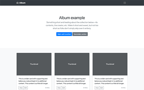
Простой одностраничный шаблон для фотогалереи, портфолио и т.д.
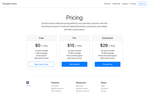
Пример страницы с ценами, созданной с помощью карточек, с настраиваемым верхним и нижним колонтитулами.
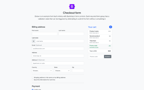
Пользовательская форма оформления заказа, показывающая наши компоненты формы и их функции проверки.
Экономичная маркетинговая страница, ориентированная на продукт, с обширной сеткой и изображениями.
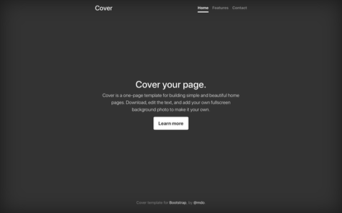
Одностраничный шаблон для создания простых и красивых домашних страниц.
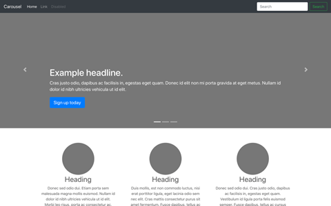
Настройте панель навигации и карусель, а затем добавьте новые компоненты.
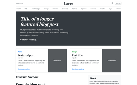
Журнал как шаблон блога с заголовком, навигацией, избранным контентом.
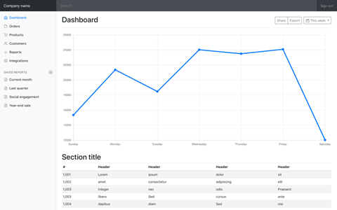
Базовая оболочка панели администратора с фиксированной боковой панелью и навигационной панелью.
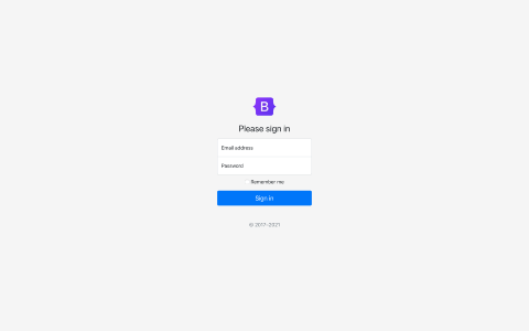
Индивидуальный макет и дизайн формы для простой формы входа.
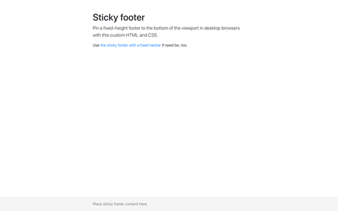
Прикрепленный нижний колонтитул к нижней части области просмотра, когда содержимое страницы мало.
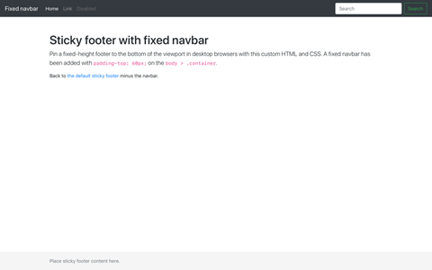
Прикрепленный нижний колонтитул к нижней части области просмотра с помощью фиксированной верхней панели навигации.
Create button-like checkboxes and radio buttons by using styles rather than on the elements. These toggle buttons can further be grouped in a button group if needed.
Single toggle
Checked
Disabled
Visually, these checkbox toggle buttons are identical to the . However, they are conveyed differently by assistive technologies: the checkbox toggles will be announced by screen readers as “checked”/“not checked” (since, despite their appearance, they are fundamentally still checkboxes), whereas the button plugin toggle buttons will be announced as “button”/“button pressed”. The choice between these two approaches will depend on the type of toggle you are creating, and whether or not the toggle will make sense to users when announced as a checkbox or as an actual button.
Checked
Radio
Disabled
Radio
Outlined styles
Different variants of , such at the various outlined styles, are supported.
Single toggleCheckedChecked success radio
Danger radio
Form Styles
By default, your forms will stack labels on top of controls and your controls
will grow to 100 percent of the available width. This is consistent with Bootstrap’s «mobile first» approach.
Inline Forms
To use an inline-layout form, use the option. To hide labels,
use the option, which keeps your labels accessible to those
using screen readers.
<%= bootstrap_form_for(@user, layout: :inline) do |f| %>
  <%= f.email_field :email, hide_label: true %>
  <%= f.password_field :password, hide_label: true %>
  <%= f.check_box :remember_me %>
  <%= f.submit %>
<% end %>
To skip label rendering at all, use option.
<%= f.password_field :password, skip_label: true %>
Horizontal Forms
To use a horizontal-layout form with labels to the left of the control, use the
option. You should specify both and
css classes as well (they default to and ).
In the example below, the checkbox and submit button have been wrapped in a
to keep them properly aligned.
<%= bootstrap_form_for(@user, layout: :horizontal, label_col: "col-sm-2", control_col: "col-sm-10") do |f| %>
  <%= f.email_field :email %>
  <%= f.password_field :password %>
  <%= f.form_group do %>
    <%= f.check_box :remember_me %>
  <% end %>
  <%= f.form_group do %>
    <%= f.submit %>
  <% end %>
<% end %>
The and css classes can also be changed per control:
<%= bootstrap_form_for(@user, layout: :horizontal) do |f| %>
  <%= f.email_field :email %>
  <%= f.text_field :age, control_col: "col-sm-3" %>
  <%= f.form_group do %>
    <%= f.submit %>
  <% end %>
<% end %>
or default value can be changed in initializer:
# config/initializers/bootstrap_form.rb
module BootstrapForm
  class FormBuilder
    def default_label_col
      'col-sm-4'
    end
    def default_control_col
      'col-sm-8'
    end
    def default_layout
      # :default, :horizontal or :inline
      :horizontal
    end
  end
end
Control col wrapper class can be modified with . This option will preserve column definition:
<%= bootstrap_form_for(@user, layout: :horizontal) do |f| %>
  <%= f.email_field :email %>
  <%= f.text_field :age, add_control_col_class: "additional-control-col-class" %>
  <%= f.form_group do %>
    <%= f.submit %>
  <% end %>
<% end %>
Custom Field Layout
The form-level can be overridden per field, unless the form-level layout was :
<%= bootstrap_form_for(@user, layout: :horizontal) do |f| %>
  <%= f.email_field :email %>
  <%= f.text_field :feet, layout: :default %>
  <%= f.text_field :inches, layout: :default %>
  <%= f.form_group do %>
    <%= f.submit %>
  <% end %>
<% end %>
A form-level can’t be overridden because of the way Bootstrap 4 implements in-line layouts. One possible work-around is to leave the form-level layout as default, and specify the individual fields as , except for the fields(s) that should be other than in-line.
Custom Form Element Styles
The option can be used to replace the browser default styles for check boxes and radio buttons with dedicated Bootstrap styled form elements. Here’s an example:
<%= bootstrap_form_for(@user) do |f| %>
  <%= f.email_field :email %>
  <%= f.password_field :password %>
  <%= f.check_box :remember_me, custom: true %>
  <%= f.submit "Log In" %>
<% end %>
Текст формы
Текст формы на уровне блока или на уровне строки может быть создан с помощью .
Связывание текста формы с элементами управления формой
Текст формы должен быть явно связан с элементом управления формы, к которому он относится, с помощью атрибута . Это гарантирует, что вспомогательные технологии, такие как программы чтения с экрана, будут объявлять этот текст формы, когда пользователь фокусируется или входит в элемент управления.
Текст формы под полями может быть оформлен с помощью . Если будет использоваться элемент уровня блока, добавляется верхнее поле для удобного разнесения между входными данными выше.
Встроенный текст может использовать любой типичный строчный HTML-элемент (будь то , или что-то еще) с не более чем классом .
Direction
Set the direction of flex items in a flex container with direction utilities. In most cases you can omit the horizontal class here as the browser default is . However, you may encounter situations where you needed to explicitly set this value (like responsive layouts).
Use to set a horizontal direction (the browser default), or to start the horizontal direction from the opposite side.
Flex item 1
Flex item 2
Flex item 3
Flex item 1
Flex item 2
Flex item 3
Use to set a vertical direction, or to start the vertical direction from the opposite side.
Flex item 1
Flex item 2
Flex item 3
Flex item 1
Flex item 2
Flex item 3
Responsive variations also exist for .
Supported Form Controls
Bootstrap natively supports the most common form controls mainly input, textarea, checkbox, radio, and select.
Inputs
<form role = "form">

   <div class = "form-group">
      <label for = "name">Label</label>
      <input type = "text" class = "form-control" placeholder = "Text input">
   </div>

</form>
Textarea
The textarea is used when you need multiple lines of input. Change rows attribute as necessary (fewer rows = smaller box, more rows = bigger box).
<form role = "form">

   <div class = "form-group">
      <label for = "name">Text Area</label>
      <textarea class = "form-control" rows = "3"></textarea>
   </div>

</form>
CheckBoxes and Radio Buttons
Checkboxes and radio buttons are great when you want users to choose from a list of preset options.
-
When building a form, use checkbox if you want the user to select any number of options from a list. Use radio if you want to limit the user to just one selection.
-
Use .checkbox-inline or .radio-inline class to a series of checkboxes or radios for controls appear on the same line.
The following example demonstrates both (default and inline) types −
<label for = "name">Example of Default Checkbox and radio button </label>

<div class = "checkbox">
   <label>
      <input type = "checkbox" value = "">Option 1
   </label>
</div>

<div class = "checkbox">
   <label>
      <input type = "checkbox" value = "">Option 2
   </label>
</div>

<div class = "radio">
   <label>
      <input type = "radio" name = "optionsRadios" id = "optionsRadios1" value = "option1" checked> Option 1
   </label>
</div>

<div class = "radio">
   <label>
      <input type = "radio" name = "optionsRadios" id = "optionsRadios2" value = "option2">
      Option 2 - selecting it will deselect option 1
   </label>
</div>

<label for = "name">Example of Inline Checkbox and radio button </label>

<div>
   <label class = "checkbox-inline">
      <input type = "checkbox" id = "inlineCheckbox1" value = "option1"> Option 1
   </label>

   <label class = "checkbox-inline">
      <input type = "checkbox" id = "inlineCheckbox2" value = "option2"> Option 2
   </label>

   <label class = "checkbox-inline">
      <input type = "checkbox" id = "inlineCheckbox3" value = "option3"> Option 3
   </label>

   <label class = "checkbox-inline">
      <input type = "radio" name = "optionsRadiosinline" id = "optionsRadios3" value = "option1" checked> Option 1
   </label>

   <label class = "checkbox-inline">
      <input type = "radio" name = "optionsRadiosinline" id = "optionsRadios4" value = "option2"> Option 2
   </label>
</div>
Selects
A select is used when you want to allow the user to pick from multiple options, but by default it only allows one.
-
Use <select> for list options with which the user is familiar, such as states or numbers.
-
Use multiple = «multiple» to allow the users to select more than one option.
The following example demonstrates both (select and multiple) types −
<form role = "form">

   <div class = "form-group">
      <label for = "name">Select list</label>

      <select class = "form-control">
         <option>1</option>
         <option>2</option>
         <option>3</option>
         <option>4</option>
         <option>5</option>
      </select>

      <label for = "name">Mutiple Select list</label>

      <select multiple class = "form-control">
         <option>1</option>
         <option>2</option>
         <option>3</option>
         <option>4</option>
         <option>5</option>
      </select>

   </div>

</form>
Form Helper Options
Many of the helpers accept the same options. The exceptions are:
,
,
,
,
,
,
,
,
,
,
,
,
,
,
,
The options for the form helpers that aren’t in the exceptions list are described in the following sub-sections:
Labels
Use the option if you want to specify the field’s label text:
<%= f.password_field :password_confirmation, label: "Confirm Password" %>
To hide a label, use the option. This adds the
class, which keeps your labels accessible to those using screen readers.
<%= f.text_area :comment, hide_label: true, placeholder: "Leave a comment..." %>
To add custom classes to the field’s label:
<%= f.text_field :email, label_class: "custom-class" %>
Or you can add the label as input placeholder instead (this automatically hides the label):
<%= f.text_field :email, label_as_placeholder: true %>
Input Elements / Controls
To specify the class of the generated input tag, use the option:
<%= f.text_field :email, control_class: "custom-class" %>
Help Text
To add help text, use the option:
<%= f.password_field :password, help: "Must be at least 6 characters long" %>
This generates:
<small class="form-text text-muted">Must be at least 6 characters long</small>
This gem is also aware of help messages in locale translation files (i18n):
en:
  activerecord:
    help:
      user:
        password: "A good password should be at least six characters long"
Help translations containing HTML should follow the convention of appending to the name:
en:
  activerecord:
    help:
      user:
        password_html: "A <strong>good</strong> password should be at least six characters long"
If your model name has multiple words (like ), the key on the
translation file should be underscored ().
You can override help translations for a particular field by passing the
option or turn them off completely by passing .
Prepending and Appending Inputs
You can pass and/or options to input fields:
<%= f.text_field :price, prepend: "$", append: ".00" %>
If you want to attach multiple items to the input, pass them as an array:
<%= f.text_field :price, prepend: , append: %>
You can also prepend and append buttons. Note: The buttons must contain the
class to generate the correct markup.
<%= f.text_field :search, append: link_to("Go", "#", class: "btn btn-secondary") %>
To add a class to the input group wrapper, use the option.
<%= f.email_field :email, append: f.primary('Subscribe'), input_group_class: 'input-group-lg' %>
Additional Form Group Attributes
Bootstrap mark-up dictates that most input field types have the label and input wrapped in a .
If you want to add an additional CSS class or any other attribute to the form group div, you can use the option.
<%= f.text_field :name, wrapper: { class: 'has-warning', data: { foo: 'bar' } } %>
Which produces the following output:
<div class="form-group has-warning" data-foo="bar">
  <label class="form-control-label" for="user_name">Id</label>
  <input class="form-control" id="user_name" name="user" type="text">
</div>
If you only want to set the class on the form group div, you can use the option. It’s just a short form of .
Suppressing the Form Group Altogether
You may want to define your own form group div around a field. To do so, add the option to the input field. For example:
f.form_group :user do
  f.email_field :email, wrapper: false
end
Note that Bootstrap relies on the form group div to correctly format most fields, so if you use the option, you should provide your own form group div around the input field. You can write your own HTML, or use the helper.
Подключение к функции PHP Mail
Теперь нужно написать скрипт, который будет получать данные из формы AJAX, и отправлять контент через функцию PHP Mail. Откройте файл process.php и добавьте в него следующий код:
<?php
$name = $_POST;
$email = $_POST;
$message = $_POST;

$EmailTo = "emailaddress@test.com";
$Subject = "New Message Received";

// готовим тело электронного письма
$Body .= "Name: ";
$Body .= $name;
$Body .= "n";

$Body .= "Email: ";
$Body .= $email;
$Body .= "n";

$Body .= "Message: ";
$Body .= $message;
$Body .= "n";

// отправляем электронную почту
$success = mail($EmailTo, $Subject, $Body, "From:".$email);

// перенаправляем на страницу сообщения об успешной отправке данных формы
if ($success){
   echo "success";
}else{
    echo "invalid";
}

?>
Тело письма создается произвольно с добавлением трех созданных переменных. Сначала мы задаем текст описания, например, «Name:«, затем идет переменная, а затем перенос на новую строку (/n). Те же действия мы повторяем, связывая все данные с переменной $body.
Чтобы отправить электронное письмо, мы присоединяем его к почтовой функции. Присвоив значение переменной $success, мы задаем адрес электронной почты, на который будет отправлено письмо, тему письма, тело и адрес электронной почты отправителя.
Чтобы начать процесс отправки электронной почте, нужно вызвать его в операторе if. Таким образом можно проверить, были ли данные формы успешно предоставлены или нет. Если функция Mail возвращает “true”, скрипт возвращает “success”, если функция выдает ошибку, возвращается “invalid”.
Этот результат будет возвращаться объекту AJAX, и обрабатываться на стороне клиента. Преимущества AJAX заключается в том, что все это делается в асинхронном режиме на стороне клиента. Это позволяет пользователю продолжать взаимодействовать с сайтом во время отправки данных AJAX form:
Флажки и переключатели
Bootstrap 4 предоставляет классы .form-check, .form-check-label, .form-check-input и .form-check-inline для отображения флажков и переключателей.
Чтобы отобразить флажки или переключатели друг под другом, вложите каждый из них в элемент <div> с классом .form-check. Кроме того, добавьте .form-check-label к элементу <label> и .form-check-input к элементу <input>.
В одну строку
В Bootstrap 4 флажки и переключатели по умолчанию располагаются друг под другом. Вы можете отобразить их в одну строку, добавив .form-check-inline к внешнему <div>. Оставьте .form-check-input в элементе <input>.
<link rel=»stylesheet» href=»https://maxcdn.bootstrapcdn.com/bootstrap/4.0.0/css/bootstrap.min.css»>
<!— Флажки —>
<div class=»form-check form-check-inline»>
<input class=»form-check-input» type=»checkbox» id=»inlineCheckbox1″ value=»1″>
<label class=»form-check-label»>1</label>
</div>
<div class=»form-check form-check-inline»>
<input class=»form-check-input» type=»checkbox» id=»inlineCheckbox2″ value=»2″>
<label class=»form-check-label»>2</label>
</div>
<div class=»form-check form-check-inline»>
<input class=»form-check-input» type=»checkbox» id=»inlineCheckbox3″ value=»3″>
<label class=»form-check-label»>3</label>
</div>
<!— Переключатели —>
<div class=»form-check form-check-inline»>
<input class=»form-check-input» type=»radio» name=»inlineRadioOptions» id=»inlineRadio1″ value=»1″>
<label class=»form-check-label»>1</label>
</div>
<div class=»form-check form-check-inline»>
<input class=»form-check-input» type=»radio» name=»inlineRadioOptions» id=»inlineRadio2″ value=»2″>
<label class=»form-check-label»>2</label>
</div>
<div class=»form-check form-check-inline»>
<input class=»form-check-input» type=»radio» name=»inlineRadioOptions» id=»inlineRadio3″ value=»3″>
<label class=»form-check-label»>3</label>
</div>
</div>
Bootstrap 4 против Bootstrap 3
Bootstrap 3 для отображения флажков и переключателей использует .radio, .radio-inline, .checkbox или .checkbox-inline. Bootstrap 4 использует .form-check, .form-check-label, .form-check-input и .form-check-inline.
Forms
Every group of form fields should reside in a element. Bootstrap provides no default styling for the element, but there are some powerful browser features that are provided by default.
- New to browser forms? Consider reviewing the MDN form docs for an overview and complete list of available attributes.
- s within a default to , so strive to be specific and always include a .
- You can disable every form element within a form with the attribute on the .
Since Bootstrap applies and to almost all our form controls, forms will by default stack vertically. Additional classes can be used to vary this layout on a per-form basis.
Required Fields
A label that is associated with a required field is automatically annotated with
a CSS class. doesn’t provide any styling for required fields. You’re free to add any appropriate CSS to style
required fields as desired. One example would be to automatically add an
asterisk to the end of the label:
label.requiredafter {
  content" *";
}
The label class is determined based on the definition of a presence
validator with the associated model attribute. Presently this is one of:
ActiveRecord::Validations::PresenceValidator or
ActiveModel::Validations::PresenceValidator.
In cases where this behaviour is undesirable, use the option to force the class to be present or absent:
<%= f.password_field :login, label: "New Username", required: true %>
<%= f.password_field :password, label: "New Password", required: false %>
Create responsive stacks of full-width, “block buttons” like those in Bootstrap 4 with a mix of our display and gap utilities. By using utilities instead of button specific classes, we have much greater control over spacing, alignment, and responsive behaviors.
Button
Button
Here we create a responsive variation, starting with vertically stacked buttons until the breakpoint, where replaces the class, thus nullifying the utility. Resize your browser to see them change.
Button
Button
You can adjust the width of your block buttons with grid column width classes. For example, for a half-width “block button”, use . Center it horizontally with , too.
Button
Button
Additional utilities can be used to adjust the alignment of buttons when horizontal. Here we’ve taken our previous responsive example and added some flex utilities and a margin utility on the button to right align the buttons when they’re no longer stacked.
Button
Button
Наводим блеск
Теперь мы сконцентрируемся на обеспечении обратной связи с пользователем с помощью различных дополнительных функций, которые можно включить. В частности, мы рассмотрим обратную связь формы с помощью обработки ошибок, как на стороне клиента, так и на стороне сервера.
Также для валидации формы мы используем некоторые инструменты:
- Animate.css;
- Bootstrap Validator.
Добавьте их в проект, как мы ранее делали с Bootstrap и JQuery. Эти инструменты помогут обеспечить обратную связь с пользователем после того, как он отправил данные.
Структура проекта теперь должна выглядеть следующим образом:
Quick start
Looking to quickly add Bootstrap to your project? Use jsDelivr, a free open source CDN. Using a package manager or need to download the source files? Head to the downloads page.
JS
Many of our components require the use of JavaScript to function. Specifically, they require our own JavaScript plugins and Popper. Place one of the following s near the end of your pages, right before the closing tag, to enable them.
Bundle
Include every Bootstrap JavaScript plugin and dependency with one of our two bundles. Both and include Popper for our tooltips and popovers. For more information about what’s included in Bootstrap, please see our section.
Separate
If you decide to go with the separate scripts solution, Popper must come first (if you’re using tooltips or popovers), and then our JavaScript plugins.
Components
Curious which components explicitly require our JavaScript and Popper? Click the show components link below. If you’re at all unsure about the general page structure, keep reading for an example page template.
Show components requiring JavaScript
- Alerts for dismissing
- Buttons for toggling states and checkbox/radio functionality
- Carousel for all slide behaviors, controls, and indicators
- Collapse for toggling visibility of content
- Dropdowns for displaying and positioning (also requires Popper)
- Modals for displaying, positioning, and scroll behavior
- Navbar for extending our Collapse plugin to implement responsive behavior
- Toasts for displaying and dismissing
- Tooltips and popovers for displaying and positioning (also requires Popper)
- Scrollspy for scroll behavior and navigation updates
More Bootstrap Form Templates for Free use
Designer: Asanti82
Form features:
- Functional form design
- Fully responsive
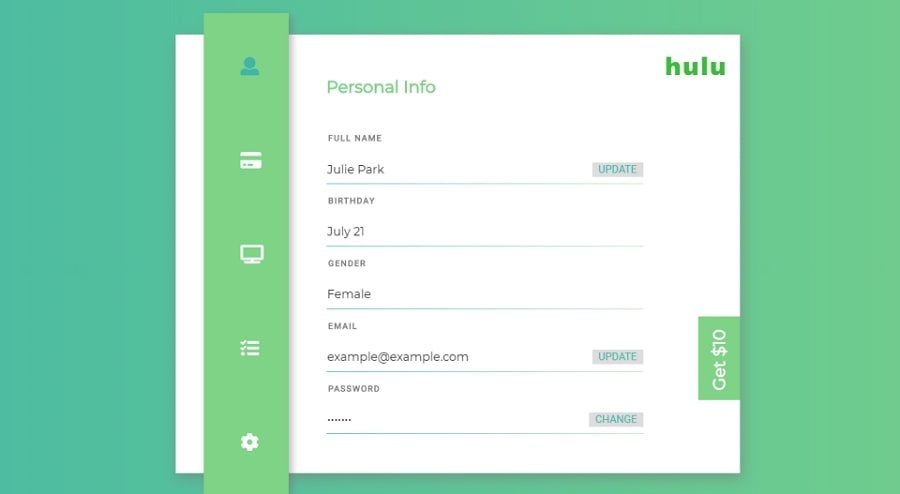
Designer: Julie Park
Form features:
- Adaptable to any web-page sidebar
- Nice color scheme
- Interactive elements
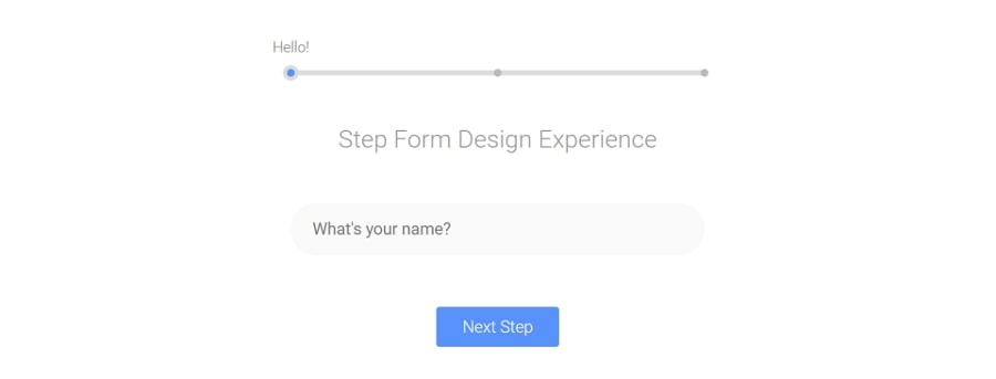
33. Step-by-Step Form Interaction
Designer: Bhakti Al Akbar
Form features:
- Step by step guidance
- Quickly get feedback from the user
- Custom styled submit button
Designer: llgruff
Form features:
Fancy header with available cards
Designer: Caspian Seagull
Form features:
- Consistent animation
- Interactive layout
- Large textboxes

Designer: Alessandro Falchi
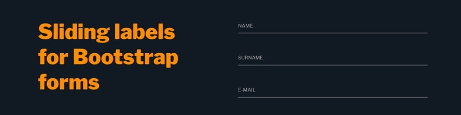
Form features:
- Sliding label effect
- Interactive layout
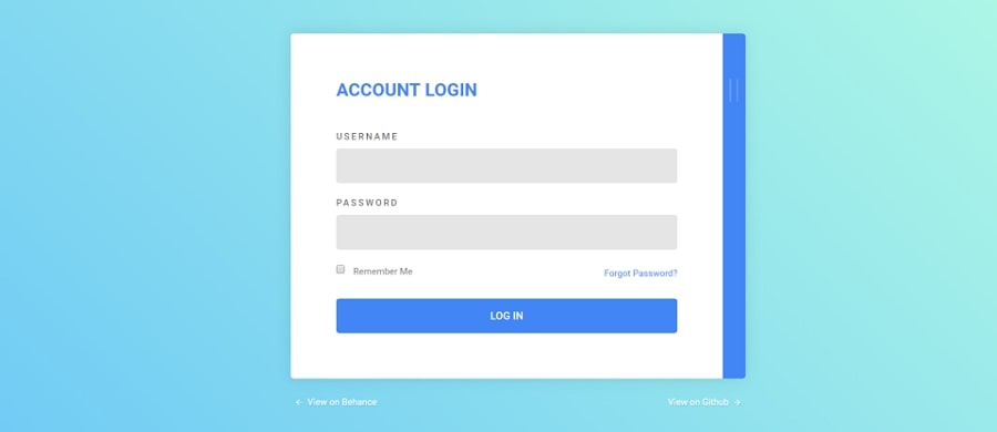
Designer: Andy Tran
Form features:
- Material inspired login form
- 2 panels: log in panel and registration panel
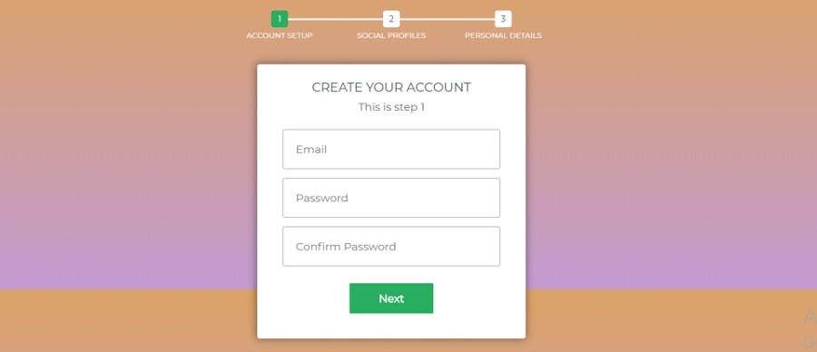
38. Multi-Step Form with Progress Bar Using jQuery and CSS3
Designer: Eric
Form features:
- Smaller logic sections
- Multiple-step form with a cool progress bar
- Suitable for registration, checkout, profile fillups and 2-factor authentication logins
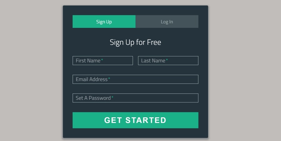
39. Sign-Up/Login Form
Designer: Eric
Form features:
- Easy to switch from sign up to log in
- Solid color buttons
- Four input areas
- Tabs and floating form labels
Important globals
Bootstrap employs a handful of important global styles and settings that you’ll need to be aware of when using it, all of which are almost exclusively geared towards the normalization of cross browser styles. Let’s dive in.
HTML5 doctype
Bootstrap requires the use of the HTML5 doctype. Without it, you’ll see some funky incomplete styling, but including it shouldn’t cause any considerable hiccups.
Responsive meta tag
Bootstrap is developed mobile first, a strategy in which we optimize code for mobile devices first and then scale up components as necessary using CSS media queries. To ensure proper rendering and touch zooming for all devices, add the responsive viewport meta tag to your .
You can see an example of this in action in the .
Box-sizing
For more straightforward sizing in CSS, we switch the global value from to . This ensures does not affect the final computed width of an element, but it can cause problems with some third-party software like Google Maps and Google Custom Search Engine.
On the rare occasion you need to override it, use something like the following:
With the above snippet, nested elements—including generated content via and —will all inherit the specified for that .
Learn more about box model and sizing at CSS Tricks.
Reboot
For improved cross-browser rendering, we use Reboot to correct inconsistencies across browsers and devices while providing slightly more opinionated resets to common HTML elements.
